
|
Note: This page is a personal test and drafting page. Please ignore it and do not edit it unless you directly collaborate with us on our current wiki activities of the Squad Wiki Editorial. |
New map page design - overview page[ | ]
Design A: current design[ | ]
Design objectives:
- This is what we currently have (see Maps)
- Sorted by biome and alphabet
- Shows scenic and iconic image for each map
Design flaws:
- Sorting maps by biome does not really serve any useful purpose
- It lacks additional useful map information (map size, map image)
- The design/look is simple (not bad, but not particularly attractive either)
Eastern Europe[ | ]
Maps based out of regions in the Russian Federation, Republic of Ukraine, the Republic of Georgia, and the Republic of Estonia. Regions include dense taiga forests, brown plains, small villages, urban areas and industrial areas.
Belaya 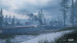 |
Fool's Road 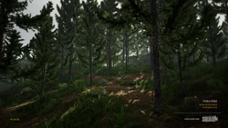 |
Gorodok 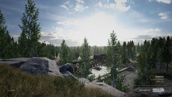 |
Mestia 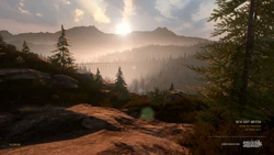 | ||
Narva 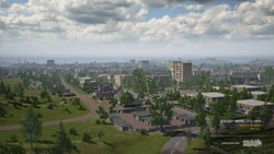 |
Operation First Light  |
Yehorivka  |
|||
Southern Asia[ | ]
Maps based out of regions in the Islamic Republic of Afghanistan and the Islamic Republic of Pakistan. Regions include massive farms, large rural communities, tall hills, and rivers.
Chora  |
Kamdesh Highlands 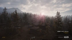 |
Kohat Toi  |
Kokan 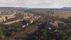 | ||
Logar Valley  |
Sumari Bala 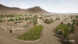 | ||||
Middle East[ | ]
Maps based out of regions in the Republic of Iraq. Regions usually consist of urban areas, villages, and large deserts.
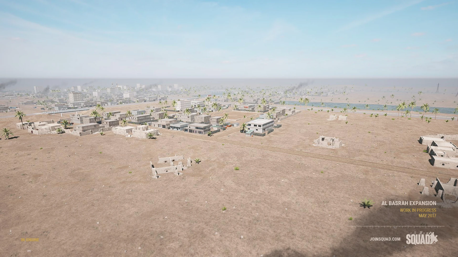
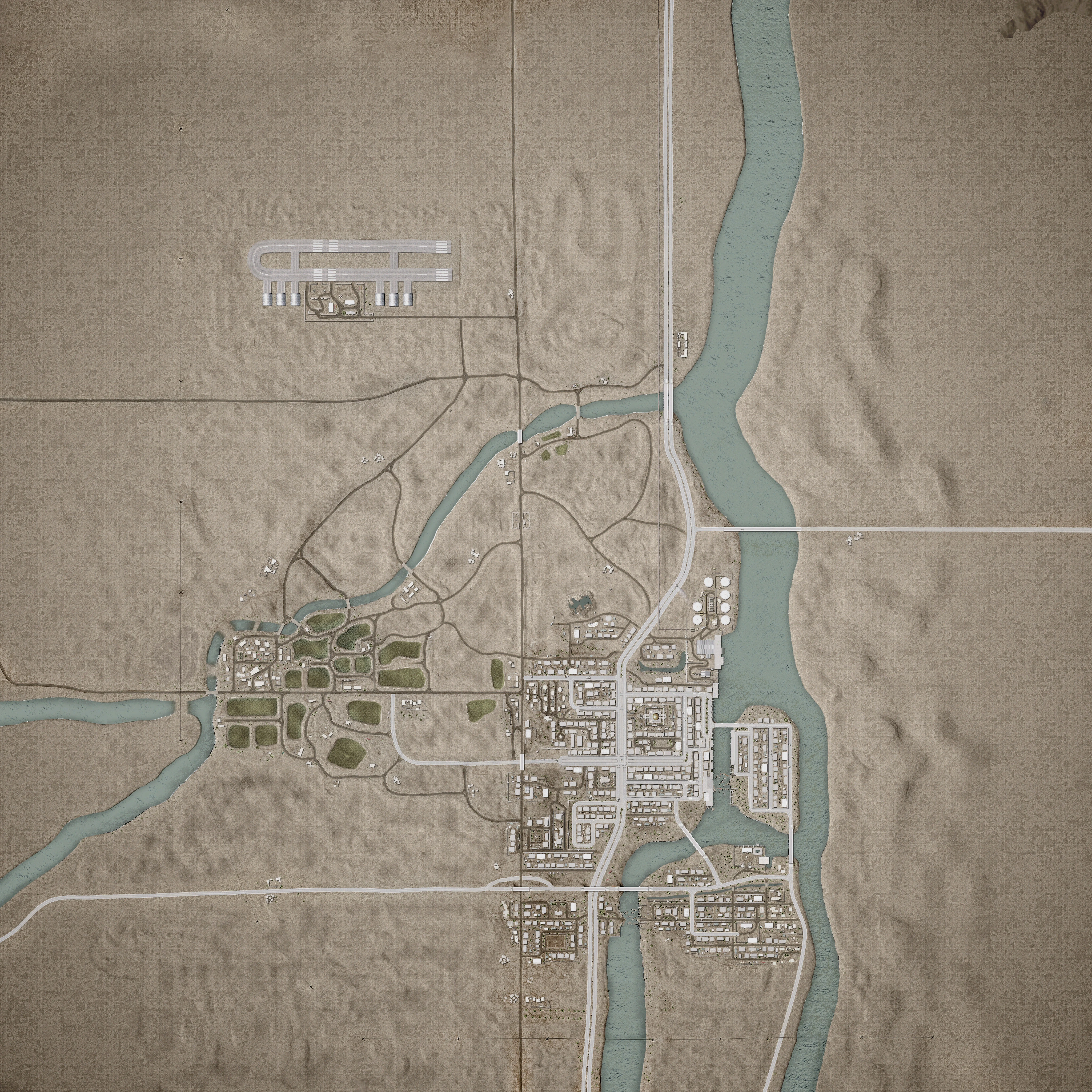
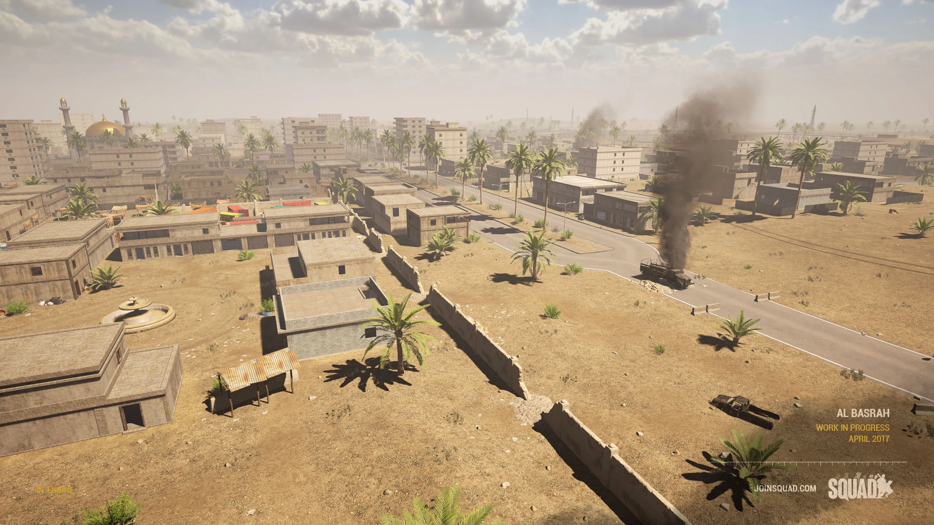
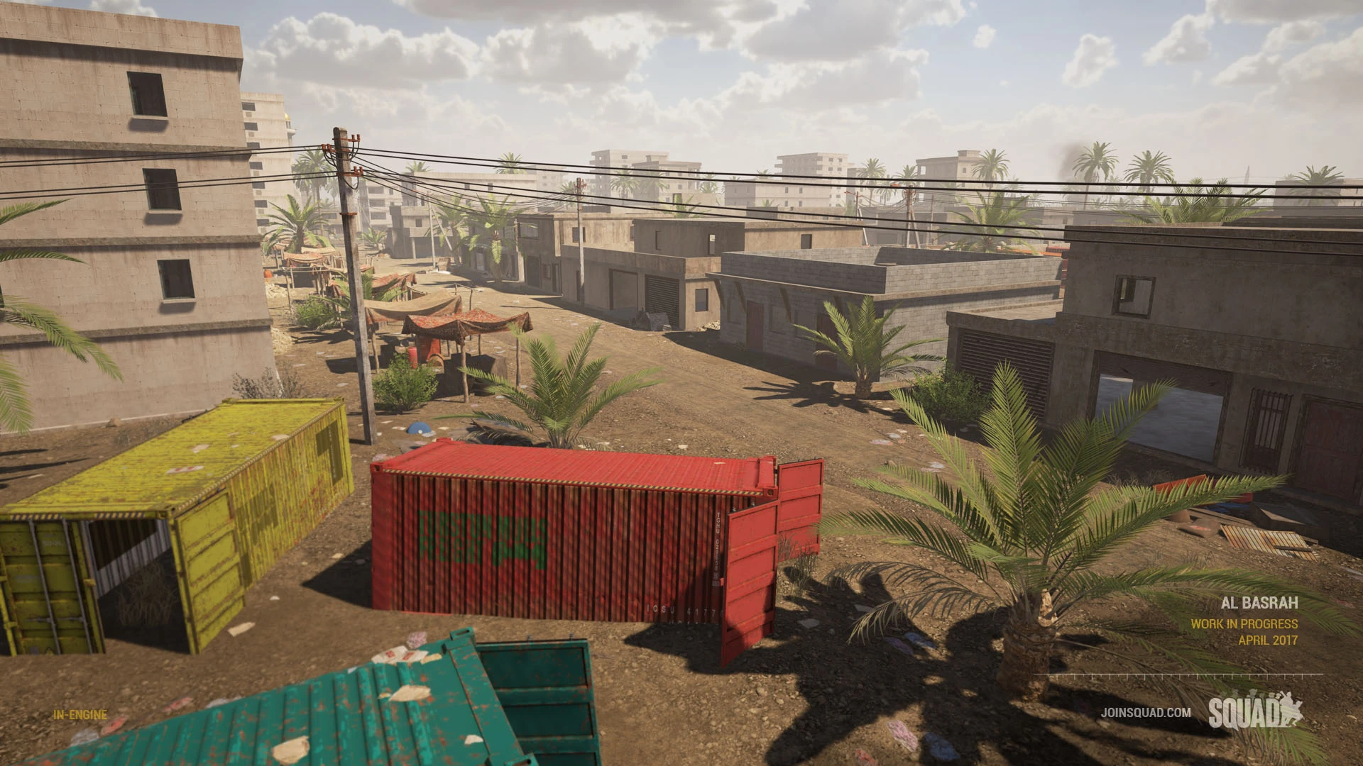
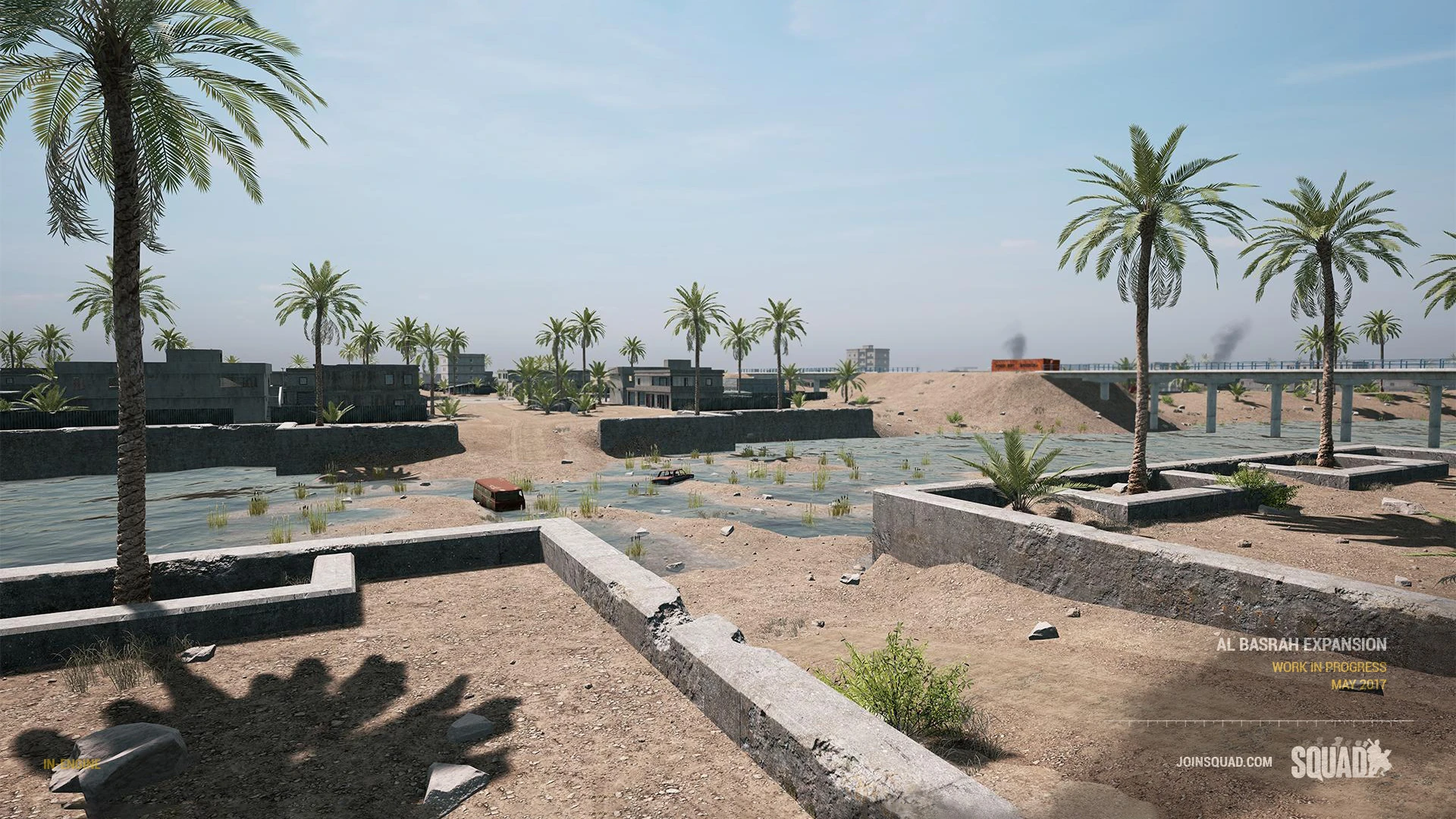
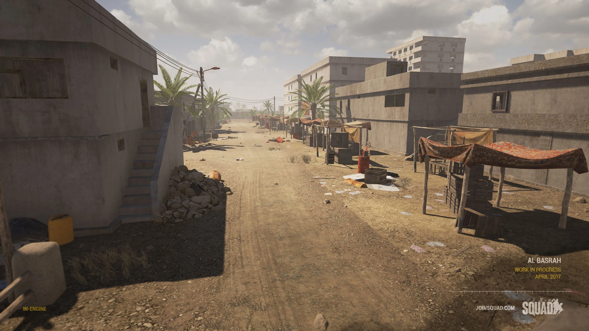
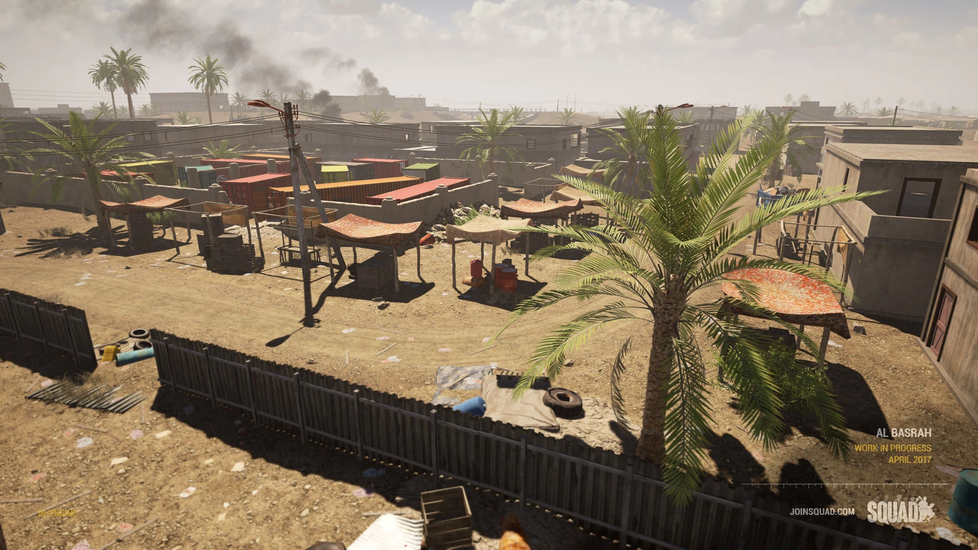
Al Basrah  |
Fallujah* 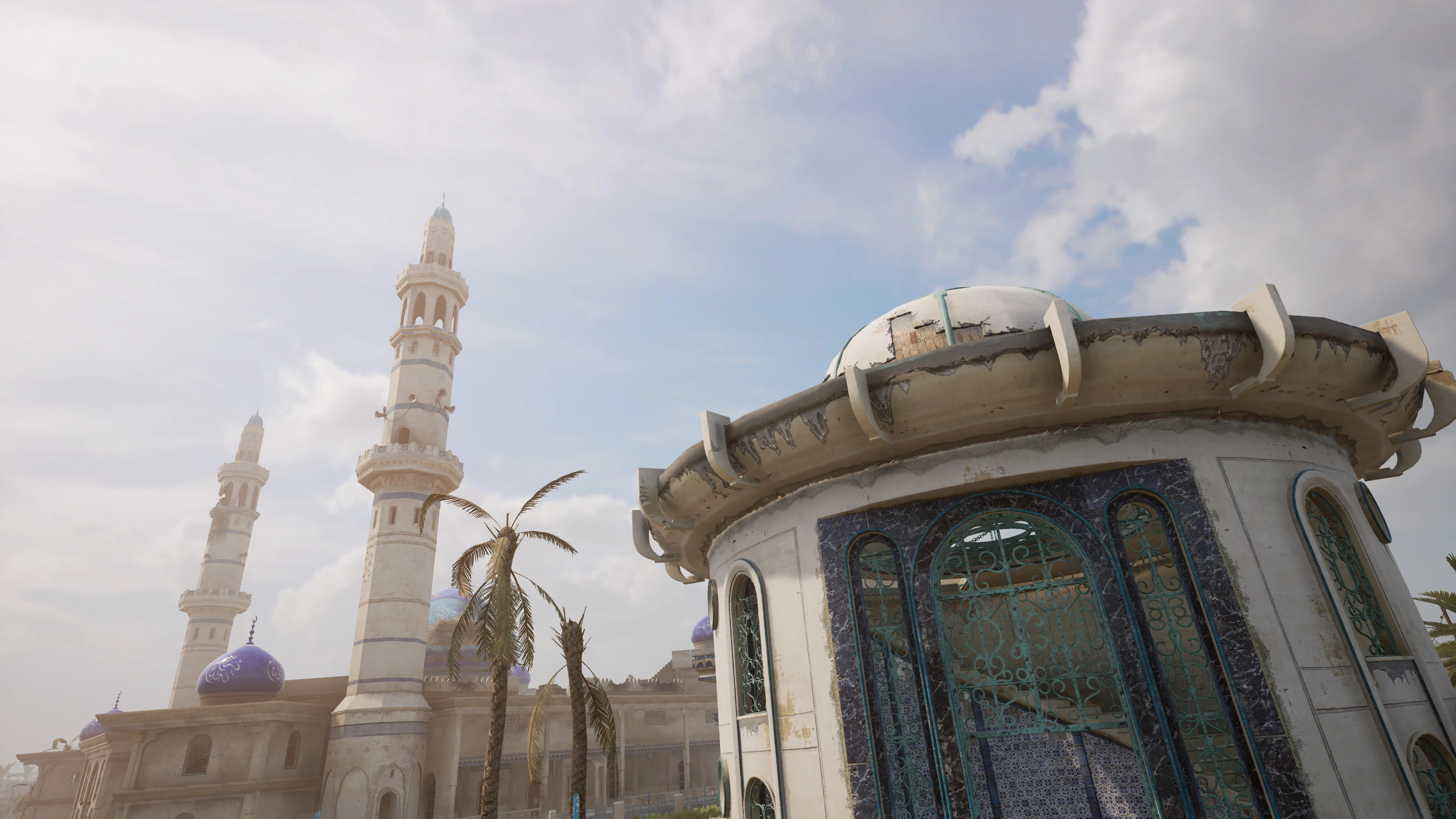 |
Tallil Outskirts* |
Training[ | ]
Players can test out weapons and vehicles and practice shooting in this camp in Southern Asia.
Jensen's Range 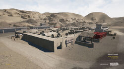 |
Design B: compact table view[ | ]
Design objectives:
- Table view with sortable columns
- Compact but informative
- Include mini-map image - we can experiment with the perfect image sizes (make it smaller or bigger)
- Further idea: a column for a list of all layers (see table below)
- Further idea: preview could be a slideshow of screenshots (see right below) - no idea how that shows up on a mobile device and how it will affect loading time of the page
Design flaws:
- What do you not like about this design? Please let me know.
| Map name | Hi-res map image | Preview | Size | Biome | Layers |
|---|---|---|---|---|---|
| Narva |  |
 |
2.3 x 2.3 km | Eastern Europe | (Design note B1: just an optional idea to add list of all layers. What do you think?) AAs v1 (US Army vs Insurgents) AAs v2 (British Army vs Insurgents) AAs v3 (US Army vs Insurgents) PAAs v1 (British Army vs Insurgents) INS v1 (US Army vs Insurgents) |
| Belaya | 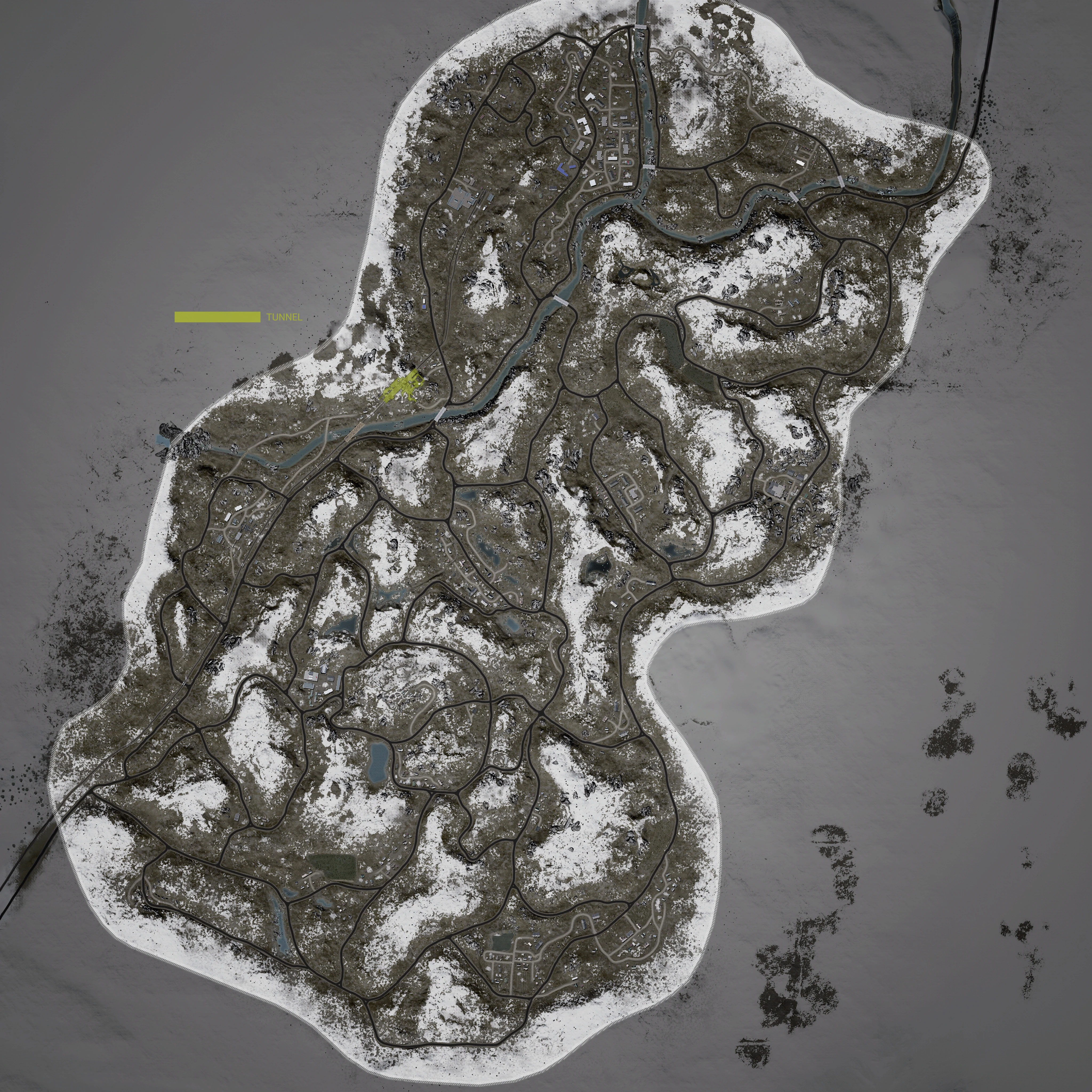 |
 |
3.9 x 3.9 km | Eastern Europe | (Design note B2: with shorter notation) AAs v1 - US vs INS AAs v2 - UK vs INS AAs v3 - US vs INS PAAs v1 - RUS vs Militia INS v1 - US vs UK |
| Yehorivka | 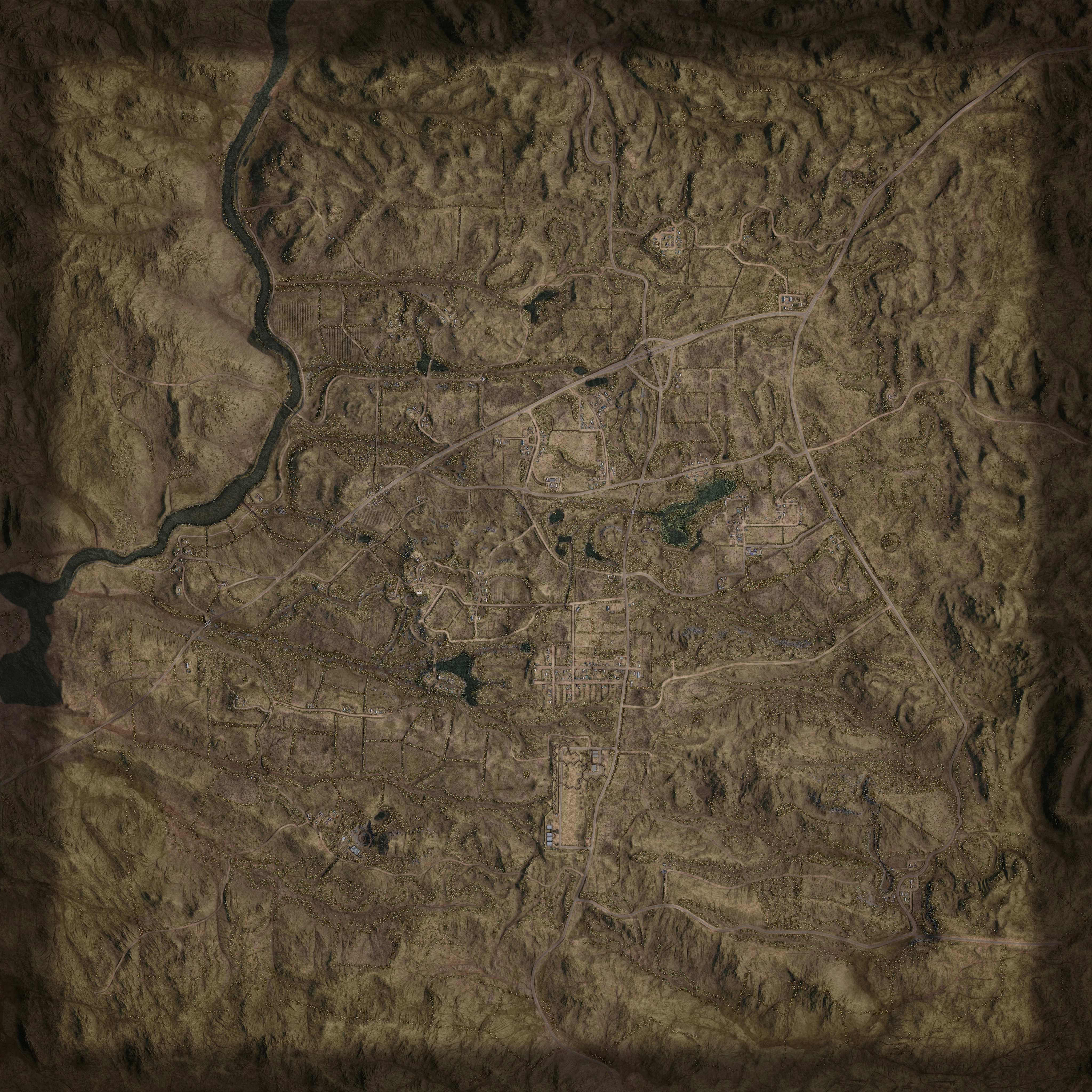 |
 |
4.2 x 4.2 km | Eastern Europe | (Design note B3: with flags only) AAs v1 - AAs v2 - AAs v3 - PAAs v1 - INS v1 - |
| Al Basrah | 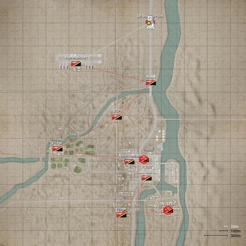 |
 |
3.2 x 3.2 km | Middle East | (Design note B4: with link to layer image) AAs v1 - |
Design C: preview of all layers[ | ]
Design objectives:
- Preview ALL layers for all maps (inspiration/competition taken from http://squadmaps.com/)
Design flaws:
- Not pretty and maybe not as practical as design B.
- Do we really need to show ALL layers on the map overview page? What is its usefulness? (Yes, http://squadmaps.com/ looks pretty with it)
 The map overview page will get far too long (vertically) and the "overview" is lost. With more and more maps in the mid- and long-term future, this does not scale at all.
Al Basrah[ | ]
 |
|
 |
|
|
|
|
|
Yehorivka[ | ]
 |
|
 |
|
|
|
|
Design D: Tabs with different views[ | ]
At the top of a wiki page, you can list different tabs, each providing different page content. This way, we could have multiple views of the map overview.
For example:
- A simple overview like today, maybe even more compact
- A detailed table of all layers, sortable columns, with useful information, similar to OWI's Map Layers for B17.
- We can preview all map layers in a list or table for each map, similar to https://squadmaps.com/
- We can automatically generate a rotation config file for server admins with all layers
- And many more
New map page design - headlines for layers[ | ]
Design A: AAS v1[ | ]
Simple headline: just the game mode and layer version.
Design B: AAS v1 - Russian Ground Forces vs. Irregular Militia[ | ]
Include factions in the headline because it is one of the most useful information and it will show up in the table of content of the wiki page (hence, useful for readers).
New map page design - layer layout[ | ]
Design A: Vertical layout (current design)[ | ]
Design objectives:
- Our current design on some map pages (example: Belaya)
Design flaws:
- Lots of horizontal space just wasted
- Reader has to scroll all the time (even to just look at all information for one layer)
- Ugly
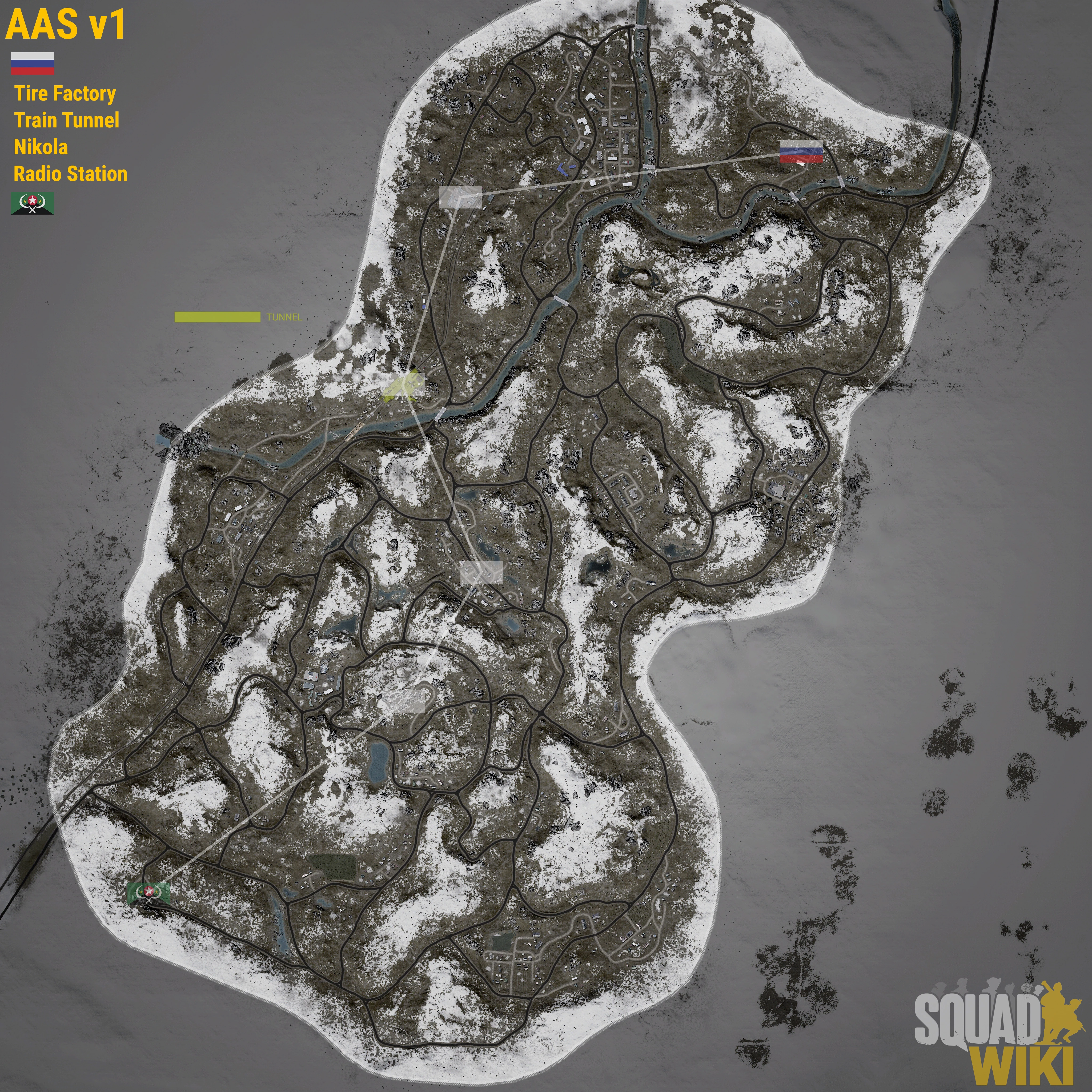
Flags
- Militia Main
- Radio Station
- Nikola
- Train Tunnel
- Tire factory
- Russia Main
| Tickets | 400 | ||||
|---|---|---|---|---|
| Vehicle | Amount | Respawn | ||
| BTR-80 | 1 | Yes | ||
| MT-LBM 6MA | 2 | Yes | ||
| Ural 4320 Truck Transport | 2 | Yes | ||
| Ural 4320 Truck Logistics | 2 | Yes | ||
| Tickets | 450 | ||||
|---|---|---|---|---|
| Vehicle | Amount | Respawn | ||
| BRDM-2 | 2 | Yes | ||
| MT-LB ZSU-23-2 | 1 | Yes | ||
| MT-LBM 6MB | 1 | Yes | ||
| Technical DShk-M | 2 | Yes | ||
| Technical SPG-9 | 1 | Yes | ||
| Rocket Artillery Technical | 2 | Yes | ||
| Technical Transport | 1 | Yes | ||
| Ural-375D Truck Transport | 1 | Yes | ||
| Ural-375D Truck Logistics | 2 | Yes | ||
Design B-1: 2 by 2 layout[ | ]
Design objectives:
- Use as little page space as possible (aka use it as efficiently as possible)
- Create a layout that gives a good overview and lets reader quickly find what they are looking
- Create a layout as esthetical pleasing as possible
Design flaws:
- Not sure how this looks on mobile view
- Still a lot of wasted space (horizontally)
|
|
Flags
|
|
| |||||||||||||||||||||||||||||||||||||||||||||||||||||||||||||||||
Design B-2: 2 by 2 layout (swap)[ | ]
Design objectives:
- Trying to put the tables above the map image to see if this feels any better
Design flaws:
- Is it better than B-1? - Depending on the tables, it flows even worse (in this example, with uneven tables, it looks terrible)
|
| |||||||||||||||||||||||||||||||||||||||||||||||||||||||||||||||||
|
|
Flags
|
Design C-1: Horizontal layout[ | ]
Design objectives:
- Use as little vertical page space as possible
Design flaws:
- Probably far worse on mobile view (unless it breaks lines nicely - we have to try it out)
- Doesn't feel/flow nicely.
|
|
Flags
|
|
| |||||||||||||||||||||||||||||||||||||||||||||||||||||||||||||||||
Design C-2: Horizontal layout (remix 1)[ | ]
Design objectives:
- Rearranage the information differently (because design C-1 doesn't feel/flow nicely)
Design flaws:
- Is it any better than the other C designs?
|
Flags
|
|
|
| |||||||||||||||||||||||||||||||||||||||||||||||||||||||||||||||||
Design C-3: Horizontal layout (remix 2)[ | ]
Design objectives:
- Small adjustment with the flag list
Design flaws:
- Is it any better than the other C designs?
|
|
|
Flags
| |||||||||||||||||||||||||||||||||||||||||||||||||||||||||||||||||
Design D: Sortable table view[ | ]
Design objectives:
- List all layers of a map in a sortable table
- Very compact and good overview
Design flaws:
- There is not enough space, even on a modern screen, to show all information without ugly line breaks
- It looks terrible; lots of empty space, very bad overview and structure
- Very complex table, hardly possible to create and maintain by hand
- Conclusion: This design is a total failure
| Game mode | Layer | Map image | Flag names | Factions | Tickets | Assets for team 1 | Assets for team 2 | ||||||
|---|---|---|---|---|---|---|---|---|---|---|---|---|---|
| Team 1 | Team 2 | Team 1 | Team 2 | Vehicle | Amount | Respawn | Vehicle | Amount | Respawn | ||||
| AAS | V1 |
|
Militia Main |
400 | 450 |
BTR-80 |
1 |
Yes |
BRDM-2 |
2 |
Yes | ||
| AAS | V2 |
|
Militia Main |
400 | 450 |
BTR-80 |
1 |
Yes |
BRDM-2 |
2 |
Yes | ||
Design F-1: Use of infobox style[ | ]
Design objectives:
- Use design style from current infoboxes
- Create shorten version of esssential layer information (without vehicle assets)
Design flaws:
- Somehow, the factions and tickets look confusing - the information is not clear, too cramped
Design F-2: Put factions into headline and data below image[ | ]
Design objectives:
- Try different spacing
Design flaws:
- A bit better but still not perfect
- Flags still missing. Damn it, where should I put them?
AAS v1 INF
| ||
|---|---|---|
|
| ||
| Team A | Team B | |
| Faction | ||
| Tickets | 400 | 400 |
Design F-3: All into one headline but multiple lines[ | ]
Design objectives:
- Make it more compact
Design flaws:
AAS v1 INF
(400) RU |
|---|
|
|
Design F-4: Two headlines[ | ]
Design objectives:
- Make it look better
Design flaws:
- But it doesn't look better
AAS v1 INF
|
|---|
(400) RU
|
|
|
Design F-4: Headlines above and below[ | ]
Design objectives:
- Make it look better
Design flaws:
AAS v1 INF
|
|---|
|
|
(400) RU
|